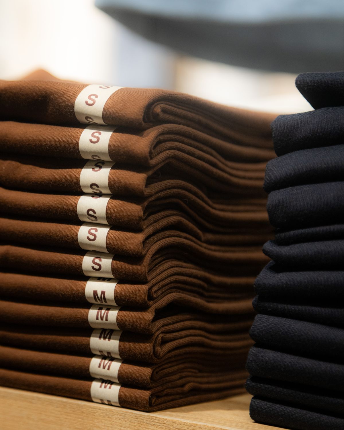
Two stores can sell the same blank tee at the same price — and one will outsell the other ten to one. The difference is identity: the bundle of visual and verbal cues that makes your store recognisable in a feed. Here's how to build one on a creator's budget.
1. Name the feeling first
Before logos, write three adjectives for how a customer should feel opening your parcel — e.g. playful, premium, rebellious. Every later choice (type, colour, packaging) gets judged against those three words.
2. One logo, three lockups
You need a primary mark, a horizontal version for headers and a tiny icon for favicons and sleeve prints. Keep it single-colour friendly: if it doesn't work in black on a tee, it doesn't work.
3. Colour is a system, not a favourite
Pick one lead colour, one support and one neutral, then use them everywhere — store banner, packing slip, thank-you card. Consistency reads as quality; randomness reads as dropshipping.
4. White-label everything
Your customer should never see your supplier's name. We ship white-label by default — plain packaging, your packing slip, your story card inside. Identity survives all the way to the doorstep.
Want a second pair of eyes? Send us your brand board and a designer will sanity-check it free with any order.